Nexamas software
Software that turns complexity into momentum.
Nexamas creates thoughtful digital products for people and organizations—across the web, desktop, and the platforms still ahead.
Web
Desktop
Browser

NexamasIdeas made useful.
Web products
Desktop products
Browser products
Current products
Tools built to help good work happen.
Explore the products available today. Each one is designed around a clear need and a better way to get the job done.
 Web product
Available now
Web product
Available now
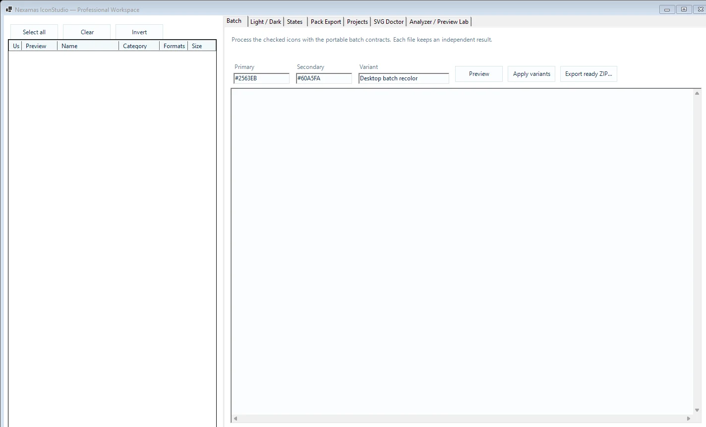
Icon asset workspace
IconStudio
Turn raw SVG and PNG files into production-ready icon assets. Recolor, inspect, batch-process, and export—directly in your browser.
- Fast browser workflow
- Batch processing
- No account required
 Desktop product
Preview preparation
Desktop product
Preview preparation
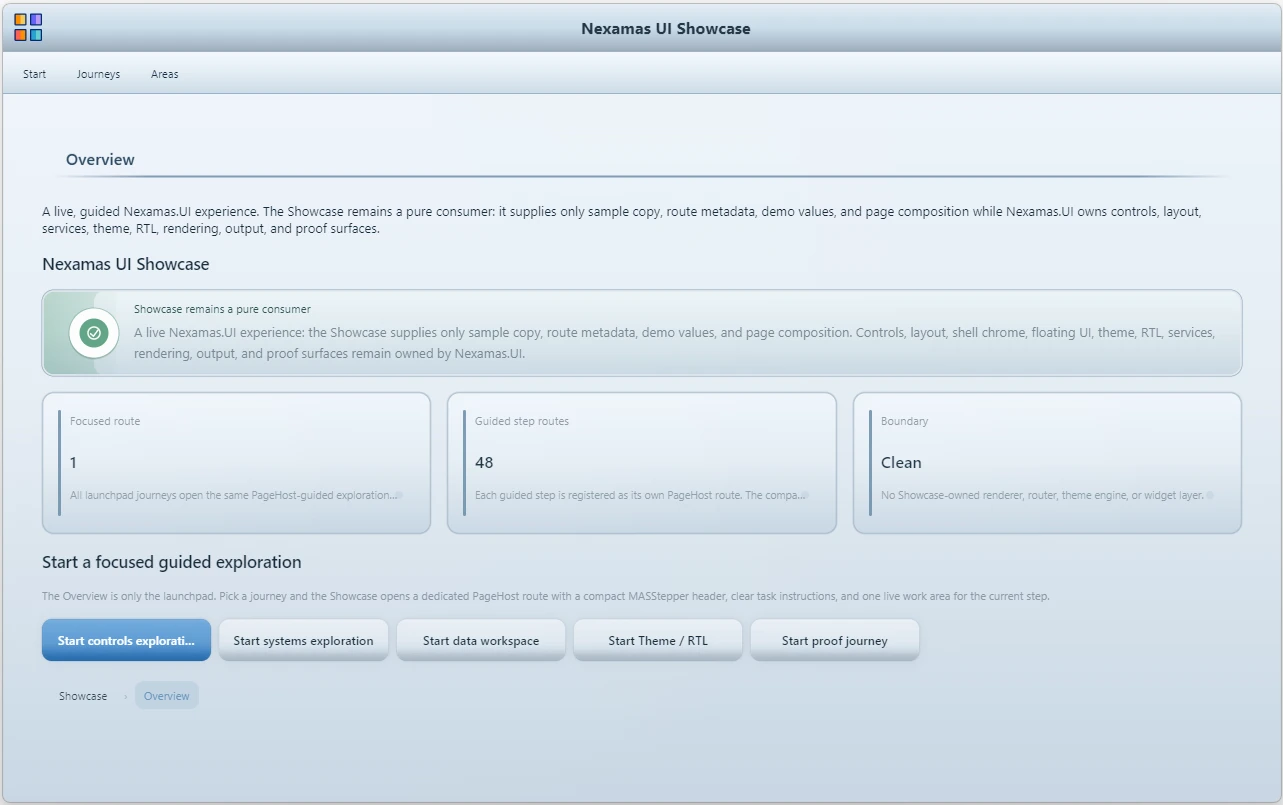
Windows UI platform
Nexamas.UI
A coherent Windows UI foundation with an approved Community and Professional inventory. Public Community Preview access is being prepared through the website release gates.
- Professional application shells
- Rich controls and data surfaces
- WinForms and .NET Framework 4.8
 Browser extension
Launching soon
Browser extension
Launching soon
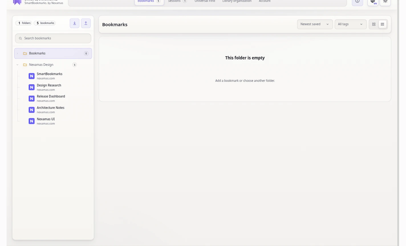
Local-first browser library
SmartBookmarks
Organize bookmarks and browser sessions locally, with optional encrypted Nexamas Cloud Vault synchronization across your devices.
- Works without an account
- Optional encrypted Cloud Vault
- Bookmarks and saved sessions